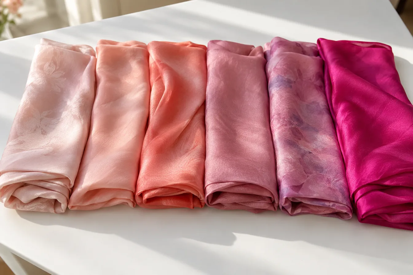
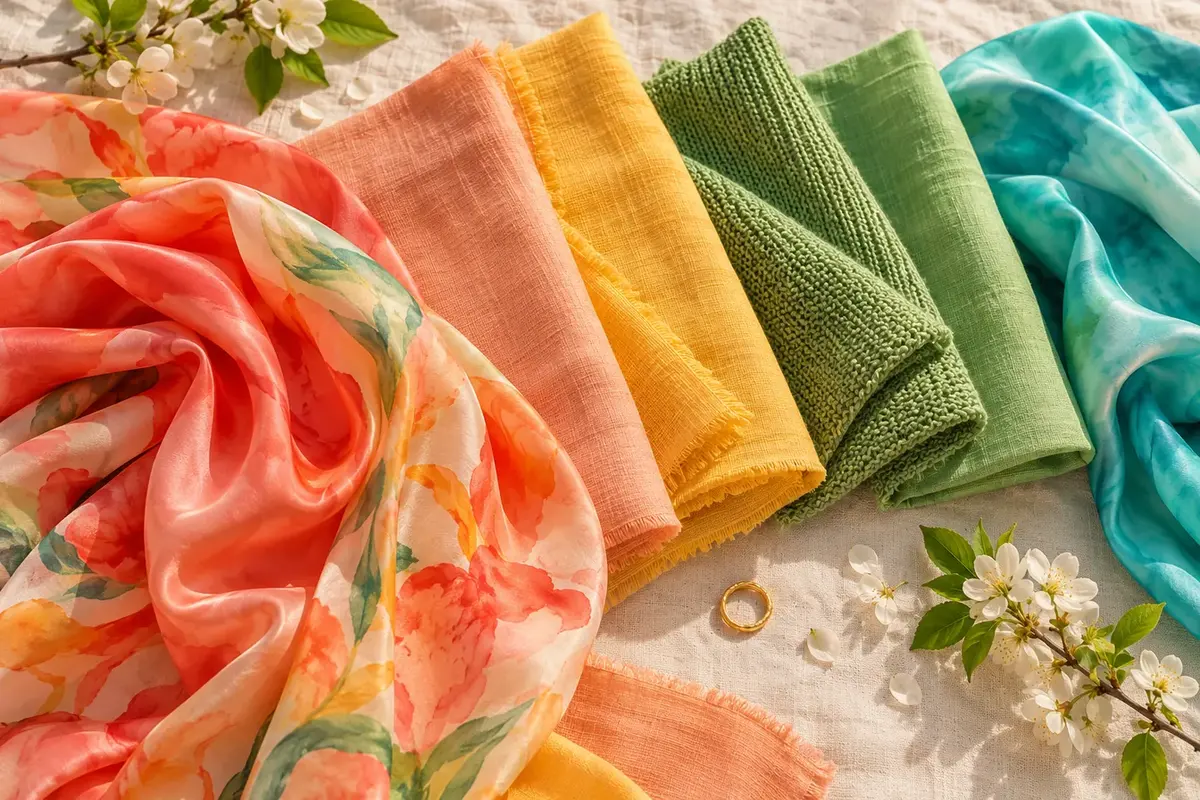
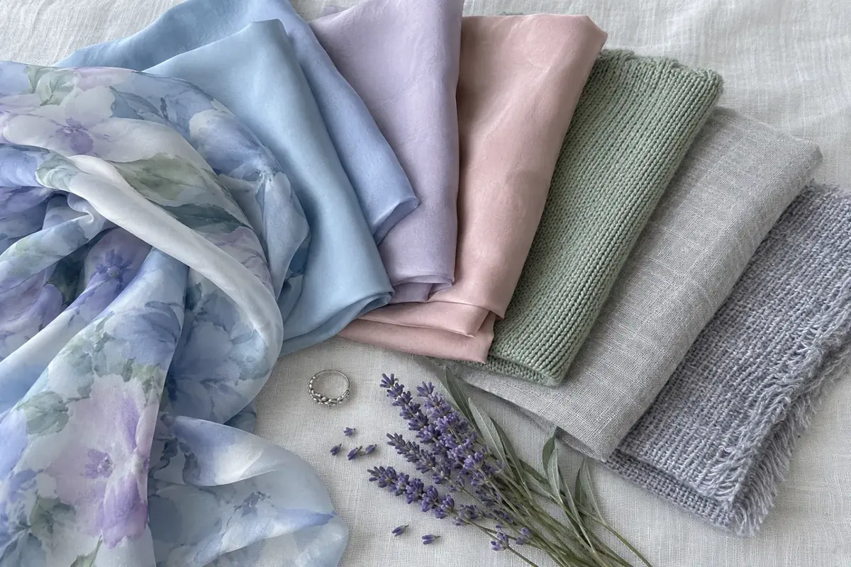
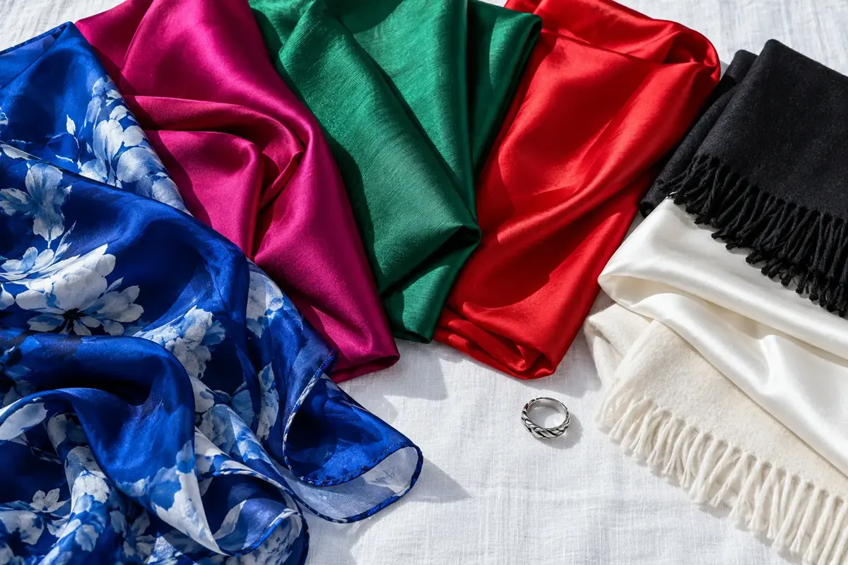
Pink is far more versatile than most people give it credit for. It is not one colour — it is a vast family spanning warm peach-pink through cool fuchsia to muted dusty rose. Almost every seasonal palette contains a version of pink. Warm skin glows in coral and peach-pink. Cool skin comes alive in fuchsia and mauve-pink. Muted coloring finds its perfect match in dusty rose and soft blush. The perception that pink is limiting or suits only certain people is simply a misunderstanding of how wide the pink spectrum really is. You can almost certainly wear pink. The only question is which one.
Pink sits between red and white on the colour spectrum, but its real versatility comes from its ability to lean warm or cool. Warm pinks (coral, peach, salmon) carry an orange-warm quality that flatters warm undertones. Cool pinks (fuchsia, magenta, mauve) carry a blue-cool quality that flatters cool undertones. Neutral pinks (true pink, medium rose) sit in the middle and work on a wide range of complexions. This warm-cool range is what makes pink accessible to almost everyone.
Saturation creates the second axis of choice. Vivid, saturated pinks — hot pink, bright fuchsia, electric coral — suit high-contrast, clear coloring. They need strong features to balance their energy. Muted pinks — dusty rose, soft blush, mauve — suit softer, lower-contrast coloring. They match the gentle saturation of muted complexions. The mistake is wearing vivid pink on muted skin (the pink overwhelms) or muted pink on vivid skin (the pink looks washed out).
Depth is the third variable. Light, pale pinks suit fair-to-medium complexions where the lightness creates a delicate, fresh effect. Deep, rich pinks suit medium-to-deep complexions where the depth creates contrast. A pale baby pink on deep skin can look chalky. A deep fuchsia on very fair, delicate coloring can look harsh. Match the pink's depth to your coloring's depth, and it will look natural rather than forced.