Color Analysisfor Beginners
Color analysis sounds technical, but the idea is simple: some colors make you look healthy and. Discover how to find the colors that actually flatter your coloring.
Color analysis sounds technical, but the idea is simple: some colors make you look healthy and radiant, and others wash you out. This beginner's guide explains how it works in plain language — what undertone and contrast mean, how the seasons fit together, and how to start finding the colors that flatter you most.


3,000+
happy clients
What Color Analysis Actually Is
Color analysis sounds technical, but the idea is simple: some colors make you look healthy and radiant, and others wash you out. This beginner's guide explains how it works in plain language — what undertone and contrast mean, how the seasons fit together, and how to start finding the colors that flatter you most.
Color analysis is the practice of matching the colors you wear to your natural coloring — your skin, hair, and eyes. When a color harmonizes with you, your skin looks even and glowing, shadows soften, and your eyes brighten. When it fights your coloring, you can look tired, sallow, or older than you are, even with the exact same face.
It rests on three simple ideas. Undertone is whether your skin leans warm (golden, peachy), cool (pink, blue), or neutral. Contrast is how much difference there is between your hair, skin, and eyes — high contrast like dark hair on fair skin, or low contrast where everything is similar in depth. Chroma is whether clear, bright colors or soft, muted colors suit you best.
These traits combine into the popular "12 season" system — Spring, Summer, Autumn, and Winter, each split into three. Your season is a shorthand for a whole palette of colors that flatter you. You do not need to memorize the theory to benefit; you just need to know which direction your coloring leans.
What is color analysis in simple terms?
Color analysis matches the colors you wear to your natural skin, hair, and eyes. Flattering colors make your skin look even and glowing; unflattering ones wash you out. The goal is to find the palette that makes you look your healthiest and most vibrant.
The Four Seasonal Directions
Spring: Warm and Bright
Spring coloring is warm and clear, with a fresh, light quality. If sunny, warm, vivid colors like coral and golden yellow make you glow, you may lean spring. These palettes feel lively and sun-lit, and they suit people with warm undertones and a bright, delicate look.
Summer: Cool and Soft
Summer coloring is cool and muted, with a gentle, low-contrast quality. If soft, dusty, cool colors like rose and powder blue flatter you more than bold brights, you may lean summer. These palettes feel calm and elegant, suiting cool undertones with a soft overall look.
Autumn: Warm and Deep
Autumn coloring is warm and rich, with earthy depth. If warm, muted, earthy colors like rust and olive make you look radiant, you may lean autumn. These palettes feel grounded and luxurious, suiting warm undertones with deeper or golden coloring.
Winter: Cool and Bright
Winter coloring is cool and clear, with strong contrast. If bold, icy, high-contrast colors like true red and emerald suit you, you may lean winter. These palettes feel striking and crisp, suiting cool undertones with vivid, high-contrast features.

Ready to skip the theory and see your palette?
Start my color analysisHow to Start Finding Your Colors
Check your undertone
Look at the veins on your inner wrist in daylight. Blue or purple veins usually mean cool undertones; green usually means warm; a mix suggests neutral. Notice whether gold or silver jewelry makes your skin look healthier — gold flatters warm, silver flatters cool.
Judge your contrast
In a mirror, notice how different your hair, skin, and eyes are from each other. A big difference (dark hair, fair skin) is high contrast and suits bolder, clearer colors. A gentle difference is low contrast and suits softer, blended palettes.
Test colors near your face
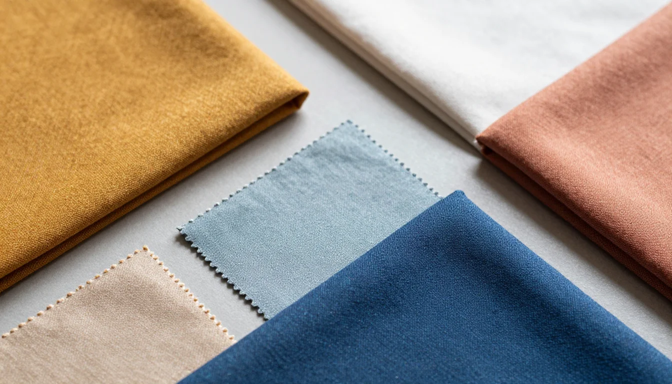
Hold different colored fabrics up to your face in natural light. Flattering colors make your skin look even and your eyes brighter. Unflattering ones bring out shadows, redness, or a tired look. Trust what you see, not what you expect.
Start with a direction, not a label
You do not need your exact season on day one. Begin by learning whether you lean warm or cool, bright or soft. That alone will steer you toward far more flattering choices while you refine the details.

Common Mistakes Beginners Make
Pure white for everyone
Crisp, cool white flatters cool and high-contrast coloring, but it can look harsh on warm or soft types. Many people are better served by ivory or warm white. There is no single universal neutral.
Black as a default
Black is not flattering on everyone, especially soft or light coloring, where it can overwhelm the face and cast harsh shadows. Softer types often look better in navy, charcoal, or deep brown.
Trend colors regardless of fit
A color being fashionable does not mean it suits you. Beginners often buy the season's "it" shade only to find it drains their face. Fit matters more than trend.
Ignoring undertone
Choosing colors by preference alone, without checking whether they run warm or cool, is the most common misstep. The same color in the wrong temperature can undo an otherwise flattering choice.
Warm or cool? Bright or soft? Find out
Find my seasonSimple Swaps for Beginners
Easy first changes that make a visible difference while you learn your palette.
Softer darks flatter without overwhelming a gentle face.
Warm whites harmonize with warm undertones instead of clashing.
The right temperature is what makes a color flattering.
Soft coloring glows in gentle shades, not high-saturation brights.
Matching metal to undertone ties a whole look together.
Which Palette Might Be Yours?
Once you know your general direction, a seasonal palette gives you a full set of flattering colors. Here are a few starting points to explore.
Warm Spring
Learn moreWarm, clear, and bright coloring points here — a great starting palette if sunny colors suit you.
Cool Summer
Learn moreCool, soft, low-contrast coloring suggests cool summer — explore this if dusty, gentle colors flatter you.
Deep Winter
Learn moreCool, deep, high-contrast coloring leans deep winter — a fit if bold, icy colors make you glow.
Find Your Exact Colors
You do not have to learn all the theory to benefit from color analysis. A personalized analysis reads your undertone, contrast, and chroma for you, names your season, and hands you a ready-made palette — so you can skip the guesswork and start wearing colors that make you look your best.

Related Guides for Color Analysis for Beginners
Explore more personalized color advice based on your features.
Want to see these colors on you? What Colors Look Good on Me — free to try.
Frequently Asked Questions About Color Analysis for Beginners
What is color analysis in simple terms?
Color analysis matches the colors you wear to your natural skin, hair, and eyes. Flattering colors make your skin look even and glowing; unflattering ones wash you out. The goal is to find the palette that makes you look your healthiest and most vibrant.
How do I find my color season?
Start by identifying your undertone (warm or cool), your contrast level (high or low), and whether bright or soft colors suit you. Those three traits point to one of the 12 seasons. Testing colors against your face in natural light, or taking a color analysis, confirms it.
How do I know if I am warm or cool toned?
Check your wrist veins in daylight — blue or purple suggests cool, green suggests warm. Notice whether gold or silver jewelry flatters you more; gold favors warm undertones and silver favors cool. A mix of signals usually means neutral.
What are the 12 color seasons?
The 12 seasons expand the classic four — Spring, Summer, Autumn, Winter — into three versions each, based on whether your coloring is warmer, cooler, brighter, softer, deeper, or lighter. Each season names a full palette of flattering colors.
Do I need an expert to do color analysis?
Not necessarily. You can learn a lot by checking your undertone and contrast and testing colors near your face. A professional or an online analysis is helpful for pinpointing your exact season and giving you a ready-made palette to shop from.
Why do some colors make me look tired?
When a color clashes with your undertone or contrast level, it emphasizes shadows, redness, and unevenness in your skin, which reads as looking tired or older. Switching to a color in your flattering palette can visibly refresh your face.