Skin depth
Fair
- Warm
- Ivory, peach; apricot; honey; gold
- Cool
- Soft white, rose; berry; ash blonde; silver
- Neutral
- Mushroom, teal; rose-beige; neutral brown; mixed metals
- Olive
- Sage, muted coral; peach-rose; beige brown; antique gold
Compare skin depth and undertone without confusing surface color, camera lighting, or seasonal color analysis.
A skin tone color chart is most useful when it separates how light or deep your skin looks from the undertone beneath it. Use this inclusive reference to find a starting point for clothing, makeup, hair, and metal colors, then test those colors against your own face.


3,000+
happy clients
Start with skin depth — fair, light, medium, tan, or deep — then compare warm, cool, neutral, and olive undertones. Your overtone is the surface color you see first and can change with sun or flushing; seasonal color analysis adds depth, undertone, and chroma to find a complete palette.
A skin tone color chart is most useful when it separates how light or deep your skin looks from the undertone beneath it. Use this inclusive reference to find a starting point for clothing, makeup, hair, and metal colors, then test those colors against your own face.
Skin depth describes the visible lightness or darkness range of your complexion. Fair and deep are endpoints, while light, medium, and tan describe the middle range. Depth helps you judge how much visual weight a color can carry near your face, but it does not tell you whether that color is warm or cool.
Undertone is the consistent temperature underneath the surface: warm often reads golden or peachy, cool can read rosy or bluish, neutral sits between them, and olive can combine a muted green-grey cast with warm, cool, or neutral qualities. Olive is not a depth, and it is not automatically warm.
Overtone is the surface color you notice first. Sun exposure, a temporary flush, lighting, skincare, or recent irritation can shift it. A chart should therefore guide observation rather than label your body permanently. It is a color-and-style reference, not a medical classification or diagnosis.
Seasonal color analysis goes one step further. It combines undertone with depth or value and chroma, then places that combination in a palette such as Light Spring, Soft Summer, Deep Autumn, or Deep Winter. The same skin depth can appear in several seasons.
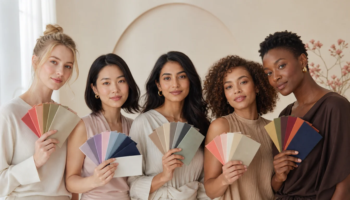
Interactive color atlas
Choose the closest visible depth, then add the undertone that behaves most like your skin in daylight. The result is a styling starting point—not a foundation match or permanent label.
Face-test rule: look for clearer eyes, softer shadows, and more even-looking skin—not the brightest swatch.
Your color coordinate
Your visible depth sits near the middle of the chart. Neutral undertones often balance warm and cool influences without one temperature dominating.
Start with these colors
Medium–deep color range · adjust lighter or deeper as needed
Clothing balance
You can usually move across medium values easily. Repeat one lighter and one deeper note to create intentional, balanced contrast.
Makeup direction
Rose-beige, balanced red, neutral mauve, cocoa, and soft coral offer flexible starting points.
Hair direction
Look first at beige blonde, balanced brunette, soft mocha, neutral chestnut, and dimensional brown.
Metal direction
Mixed metals, champagne gold, soft silver, and rose gold are all worth comparing.
Watch for: Extremely yellow or extremely blue colors may overpower the balance. Start nearer the middle, then test intensity.
Screen color, lighting, tanning, makeup, and camera processing can shift what you see. Confirm this result with real fabric in indirect daylight; this tool is for styling guidance and does not classify health or skin conditions.
Warm undertones usually look balanced beside colors with golden, yellow, or peach influence. Try ivory instead of optic white, and choose terracotta, camel, warm coral, or softened teal near your face. Your depth still matters: a fair warm complexion may need lighter versions, while deep warm coloring can carry richer rust and paprika.
Cool undertones tend to harmonize with blue, pink, or violet-based colors. Raspberry, blue-red, sapphire, and cool rose can bring clarity without adding yellow. Light cool coloring may prefer softened versions, while deep cool coloring can handle saturated jewel tones.
Neutral undertones can often move between warm and cool families, but the best version is usually balanced rather than extreme. Mushroom, denim, soft teal, rosewood, and balanced reds make useful starting points. Test depth and chroma next, because temperature alone will not choose your best palette.
Olive undertones often respond well to colors with a little grey, green, or earthy complexity. Moss, petrol blue, paprika, muted coral, and antique gold can echo that quality without turning the skin overly yellow. Olive can be cool-leaning or warm-leaning, so compare both temperature and saturation.
Find the closest depth row, then compare the undertone columns. Each cell gives compact starting points in this order: clothing, makeup, hair, and metal.
Skin depth
Skin depth
Skin depth
Skin depth
Skin depth
| Skin depth | Warm | Cool | Neutral | Olive |
|---|---|---|---|---|
| Fair | Ivory, peach; apricot; honey; gold | Soft white, rose; berry; ash blonde; silver | Mushroom, teal; rose-beige; neutral brown; mixed metals | Sage, muted coral; peach-rose; beige brown; antique gold |
| Light | Camel, coral; apricot; golden brown; gold | Slate blue, raspberry; rose; ash brown; silver | Taupe, denim; neutral rose; beige brown; mixed metals | Moss, terracotta; terracotta-rose; olive brown; gold |
| Medium | Rust, warm turquoise; cinnamon; copper brown; gold | Sapphire, berry; cranberry; cool brunette; silver | Cocoa, denim; mauve; neutral brown; mixed metals | Petrol blue, brick; terracotta-rose; espresso; gold or bronze |
| Tan | Ochre, coral; warm nude; chestnut; gold | Cobalt, wine; plum; cool espresso; silver | Teal, rosewood; neutral berry; mocha; mixed metals | Olive, paprika; terracotta; dark neutral brown; antique gold |
| Deep | Emerald, paprika; brick; warm espresso; gold | Cobalt, magenta; berry; blue-black; silver | Ink navy, jade; rosewood; neutral black-brown; mixed metals | Deep teal, rust; terracotta; espresso; bronze |
Depth labels overlap in real life. If you sit between rows, borrow from both and let the face test decide. Olive describes a cast, not a separate depth category.

Stand near a window with indirect daylight. Move makeup, bronzer, and strongly colored hair away from the face if possible. You are comparing color relationships, not judging the surface of your skin.
Compare your overall skin, hair, and eye depth together. Fair, light, medium, tan, and deep are useful reference bands, not rigid boxes. Use the nearest row and test the neighboring row if you are between depths.
Hold a warm and cool version of the same color near your face, such as peach versus raspberry or cream versus soft white. Look for more even-looking skin, clearer eyes, and softer shadows rather than a brighter swatch alone.
Use an unfiltered photo only to narrow choices. Front cameras can smooth skin, compress contrast, and shift white balance. Confirm the result with fabric or clothing in daylight before changing hair or buying a full wardrobe.
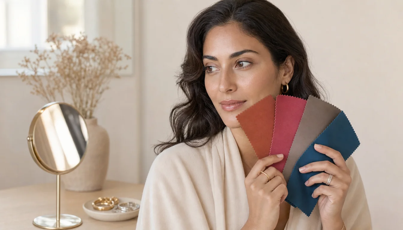
Once you have a likely depth and undertone, use our free color analysis quiz to compare the full combination against real seasonal palettes.
A tan, flush, or temporary surface change can make a warm person look cool or a cool person look warm. Compare several drapes in consistent light instead of naming undertone from one glance.
Two medium complexions can have different undertones and contrast levels. Medium skin does not automatically mean camel, coral, or any other single palette.
White balance, exposure, filters, display settings, and indoor bulbs can shift both your skin and the swatch. A digital chart is a prompt for testing, not proof of a match.
This guide only discusses visual color harmony for personal styling. It cannot identify health conditions, diagnose skin concerns, or replace advice from a qualified clinician.
Use the nearest depth and undertone match, then adjust saturation and contrast to your features.
A warmer near-neutral keeps the outfit light without creating a stark cool contrast.
Cooler muted shades support rosy or blue qualities without adding surface yellow.
Balanced colors let neutral skin show its flexibility without forcing a warm cast.
Complex earthy colors usually work better with olive depth than a single yellow-heavy neutral.
Richer cool shades carry enough depth and chroma to stay visible near a deep complexion.
A controlled side-by-side test is more useful than treating a screen swatch as an exact match.
Skin depth is only one input in seasonal color analysis. Check undertone, contrast, and chroma next, then use a season as a palette shortcut rather than a permanent label.
Use a dedicated undertone comparison when your surface color, tanning, or camera lighting makes warm, cool, neutral, and olive difficult to separate.
A warm-neutral, light, clear combination that may suit fair through medium skin when peach, ivory, and fresh turquoise create harmony.
A warm-neutral, deep, rich combination where warm olive, tan, or deep skin can carry rust, paprika, espresso, and forest green.
A cool-neutral, deep, clear combination that can appear across many skin depths when ink navy, jewel tones, and crisp contrast look most balanced.
Move from a chart row to a personalized clothing-color preview when you want to see warm, cool, neutral, and olive options on your own coloring.
See how the four parent seasons divide into specific palettes, then compare the dimensions that a simple skin chart cannot show.
The most useful skin tone chart helps you ask better questions: how deep is your coloring, what undertone repeats beneath the surface, and how much contrast can you carry? Once you test those answers against real colors, a personal color analysis can turn a broad reference into a practical palette for your wardrobe and beauty choices.
Preview Yourself In Your Palette
Get my personalized palettePreview Yourself In Your Palette

Explore more personalized color advice based on your features.
Want to see these colors on you? What Colors Look Good on Me — free to try.
A skin tone color chart is a visual reference for comparing complexion depth and undertone. It can help you organize fair, light, medium, tan, and deep depth alongside warm, cool, neutral, and olive qualities, but it cannot choose an exact foundation or season by itself.
Skin tone usually describes the visible surface depth of your complexion, while undertone describes the warmer, cooler, neutral, or olive quality beneath it. Your surface can change with sun and lighting; undertone is generally more consistent but still needs comparison in good light.
Compare warm and cool fabric pairs beside your bare face in indirect daylight. Warm undertones often harmonize with cream and peach, cool undertones with soft white and raspberry, neutral undertones with balanced versions of both, and olive undertones with complex muted greens, blue-greens, and earthy colors.
Your visible depth can look lighter or deeper after sun exposure, seasonal changes, or different lighting. That is why you should retest the surface color of makeup or clothing in current daylight, while treating undertone and seasonal analysis as separate questions.
No. Skin depth is one dimension. A seasonal result also considers undertone, value, chroma, and overall contrast, so fair, medium, tan, and deep complexions can appear in several seasons.
Online charts are useful for narrowing your starting point, not for exact color matching. Camera exposure, white balance, screen settings, makeup, and indoor bulbs can change what you see. Confirm any chart suggestion with fabric or clothing in indirect natural light.