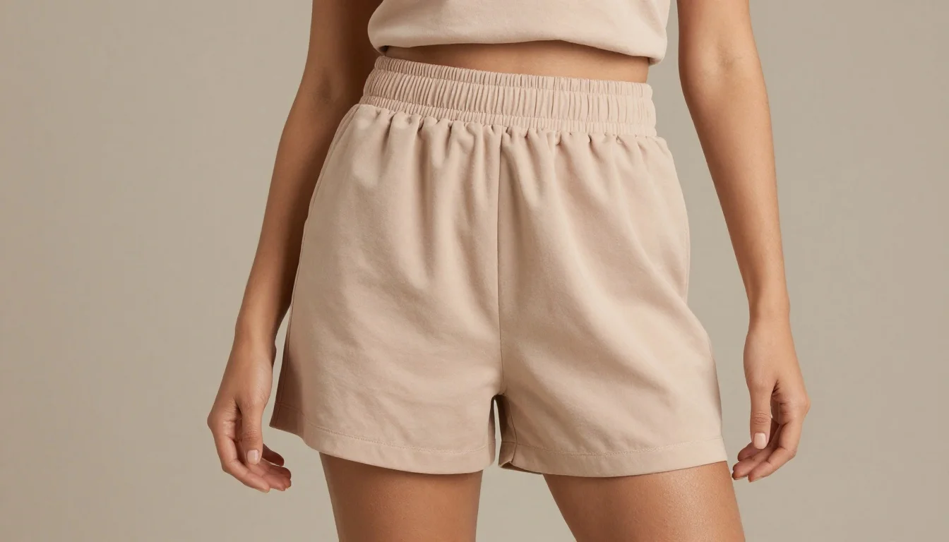
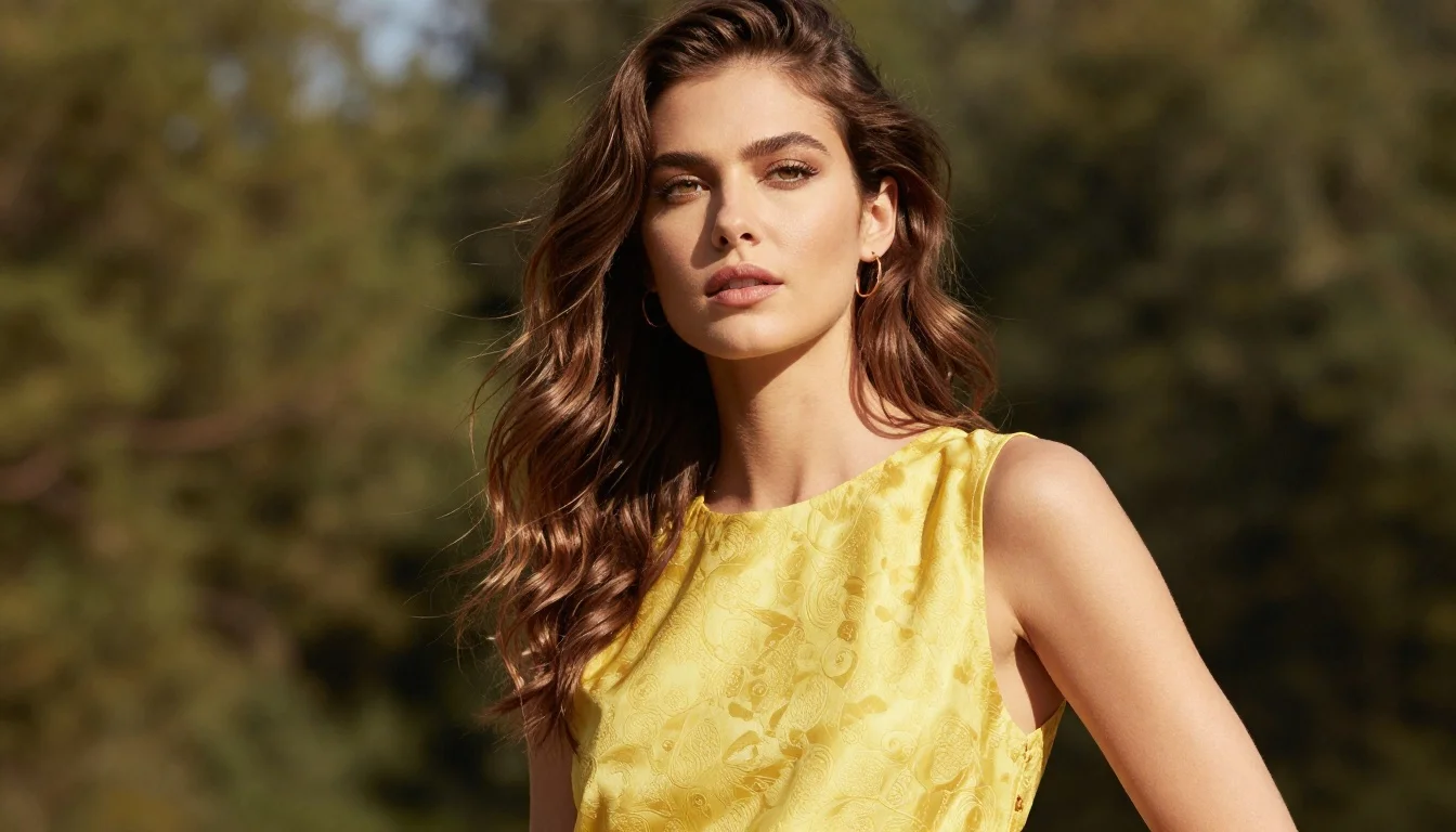
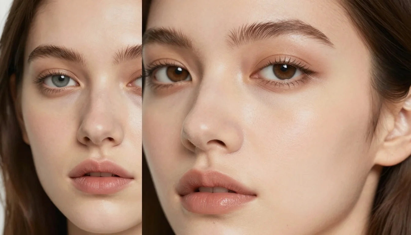
Nude is not a single colour. It is a concept — a shade that disappears against your skin, creating a seamless, second-skin effect. The problem is that fashion has historically treated nude as one pale beige. If you have fair skin, that beige might work. If you have medium, olive, or deep skin, that same beige looks ashy, chalky, or simply wrong. Your nude is determined by your skin tone, your undertone, and your depth. Getting it right creates an effortless, polished look. Getting it wrong looks like you are wearing someone else's colour.
The purpose of nude tones is to extend the visual line of your body — to create a seamless, elongating effect. When the nude matches your skin, it lengthens, smooths, and creates an uninterrupted silhouette. When it does not match, it creates a disconnection: a visible colour boundary where there should be none. This is why the wrong nude draws attention to itself, while the right nude is invisible.
Undertone is the most critical variable. Warm skin tones need warm nudes: peach, golden beige, caramel, honey. Cool skin tones need cool nudes: rose-beige, taupe, cocoa, mauve-brown. Neutral undertones have the widest range but still look best in nudes that are neither strongly warm nor strongly cool. Wearing a warm peach nude when your undertone is cool pink creates a yellow cast against the skin. Wearing a cool taupe when your undertone is golden creates an ashy, grey effect.
Skin depth is equally important. A nude that is too light for your skin reads as chalky — it sits on top of the skin rather than blending with it. A nude that is too dark reads as a distinct colour rather than a nude. The ideal nude is within one or two shades of your actual skin tone. For shoes, you can match exactly. For clothing, going slightly lighter or darker than your skin creates a subtle tonal effect that still reads as nude without disappearing completely.