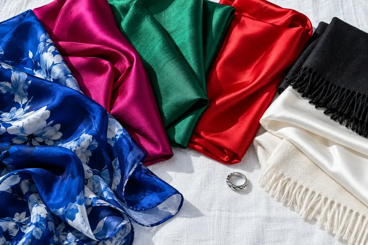
The moment you walk into a room, your color palette is already communicating something about you. Before your handshake, your pitch, or your credentials register, the hues you're wearing are sending a signal about your competence, your intentionality, and your authority. Professional dressing is as much about color selection as it is about cut or fabric — and the right palette can make an immediate, measurable difference in how seriously you're taken.
Color perception happens in milliseconds, well before conscious evaluation begins. Observers form impressions of unfamiliar people as authoritative or approachable, competent or casual, within the first fraction of a second — and color is the dominant variable. In professional contexts, the colors associated with authority and competence are deep, clear, and relatively muted in saturation: navy, charcoal, black, deep forest green, and rich burgundy.
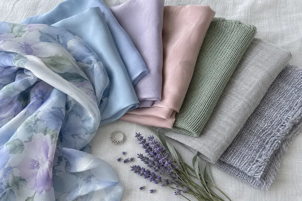
The mechanism is partly cultural (Western professional dress codes have encoded these colors for generations) and partly perceptual (deep, saturated colors have more visual 'weight,' which reads as seriousness and intention). Pale, muted, or very bright colors — regardless of how stylish they are outside the office — tend to read as less authoritative in professional settings. The clothes signal vacation before the brain registers context.
Critically, professional color isn't the same for everyone. Your natural coloring — your skin tone, undertone, hair, and eye contrast — determines which specific shades of each professional color family look intentional and polished on you versus which look draining or costume-like. A deep plum that looks commanding on someone with deep cool coloring may look slightly off on someone with warm golden undertones. Professionalism in color is always personal.