Am I a Winter ora Spring?
If vivid color loves you and muted color dulls you, you're one of these two. Temperature picks which.
Some people light up in saturated color — clear red, vivid teal, hot pink — and go flat the moment anything dusty touches their face. If that's you, you're in the bright half of the color world, where Winter and Spring live. Winter brightness is cool: icy, high-contrast, blue-based. Spring brightness is warm: sunny, golden, fresh. Same voltage, different current. Here's how to find out which one runs through your coloring.


3,000+
happy clients
Why Clarity Unites Them — and Temperature Divides Them
Some people light up in saturated color — clear red, vivid teal, hot pink — and go flat the moment anything dusty touches their face. If that's you, you're in the bright half of the color world, where Winter and Spring live. Winter brightness is cool: icy, high-contrast, blue-based. Spring brightness is warm: sunny, golden, fresh. Same voltage, different current. Here's how to find out which one runs through your coloring.
Winter and Spring are the system's two clear seasons. Both have coloring with a polished, high-definition quality — bright eyes, skin that reads clean rather than blended, often noticeable contrast between features. That's why both get the same first-pass advice: wear saturated color, avoid anything greyed or dusty.
But saturation comes in two temperatures. Winter's brights are blue-based: fuchsia, emerald, sapphire, icy lemon, true blue-red. Spring's brights are yellow-based: coral, warm turquoise, golden yellow, poppy red, fresh green. A Bright Winter in warm coral looks subtly flushed and orange; a Bright Spring in fuchsia looks suddenly severe, like the color is wearing them.
This pair matters because it sits at the system's liveliest border: Bright Spring and Bright Winter are direct neighbors, and plenty of people have tried both labels. The good news is that with brightness already settled, only one question remains — warm or cool — and that's the most testable question in all of color analysis.
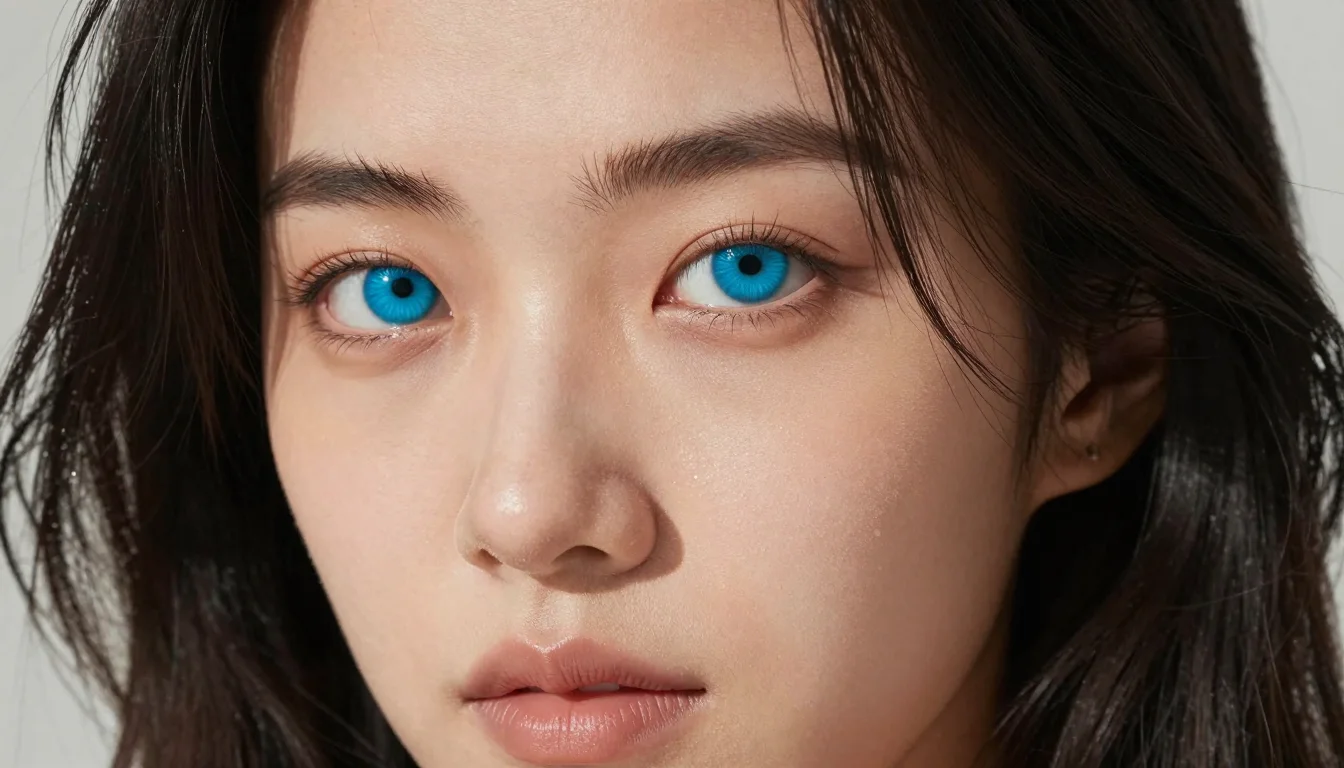
What is the difference between Winter and Spring color seasons?
Both are bright, clear seasons, but Winter is cool — fuchsia, emerald, sapphire, black, pure white — while Spring is warm — coral, turquoise, golden yellow, poppy red, ivory. Winter brights are icy and blue-based; Spring brights are sunny and yellow-based.
Winter Brights vs Spring Brights — Side by Side
Winter: Cool, Icy, and High-Voltage
Winter's brights have a cold, gemlike edge. Fuchsia over coral, emerald over lime, blue-red over poppy. Black and pure white belong here too — the hard neutrals that only high-contrast cool coloring pulls off. On a true Winter these colors look inevitable rather than loud.
Spring: Warm, Sunny, and Fresh
Spring's brights feel like a sunny morning — coral, turquoise, daffodil, poppy. Every shade carries yellow warmth, and none carries grey. On a true Spring these colors make the face look awake and youthful; the cool equivalents make the same face look stern.
The Same-Color Test Pairs
Each pair is equally bright — only the undertone flips. This is the cleanest experiment in color analysis: voltage held constant, temperature isolated. Hold each by your face in daylight and watch which one makes your skin look even and your eyes electric.
What Both Should Skip
Muted color is the shared enemy. Soft, greyed, earthy shades make bright-season faces look tired and slightly unwell — regardless of temperature. If dusty shades dull you, that's confirmation you belong on this page; it just can't tell you which side of it.

Fuchsia or coral — see both on your own face
Start my color analysisHow to Test Winter vs Spring at Home
The red test
Red is the great divider of the bright seasons. Try a blue-red (think classic lipstick red) and a poppy or tomato red (warm, orange-leaning). On a Winter the blue-red looks iconic and the poppy looks brash. On a Spring the poppy looks joyful and the blue-red looks heavy. Few tests are this decisive this fast.
The jewelry test at full contrast
Bright coloring shows metal preference clearly. Polished silver versus polished yellow gold in daylight: silver crisping up your face points Winter; gold warming it up points Spring. Use polished metals — brushed finishes mute the signal.
The white check
Pure optic white versus warm ivory. Winters wear optic white like it was invented for them. Springs look softer and healthier in ivory, while optic white leaves them slightly stark. This test matters doubly here because white t-shirts and shirts are wardrobe staples for bright seasons.
Watch your eyes
Bright seasons are famous for jewel-like eyes. Note what strengthens them: icy blue, cool emerald, and black make Winter eyes flash; warm turquoise, clear green, and golden brown make Spring eyes sparkle. If your eyes are the first thing people mention, track which colors get the compliments.

Winter or Spring — find out for sure
Both are bright, so the line is icy versus sunny. Settle it with the free color analysis quiz and get your exact sub-season.
Signs You Might Be in the Wrong Bright Season
Warm brights make you look flushed or orange (you might be Winter)
If coral, warm turquoise, and golden yellow amplify redness in your skin or cast an orange tint on it, your coloring is cool. You want the icy versions of those same colors — that's Winter territory.
Icy brights make you look severe (you might be Spring)
If fuchsia, sapphire, and stark white read as harsh — technically striking but somehow unfriendly, aging, or 'too much' — your coloring is warm. The warm equivalents will give you the same energy without the severity. That's Spring.
Black as your everyday default
Black genuinely works for Winters. On Springs it's the biggest silent downgrade in their wardrobe — it hardens warm coloring and shadows the face. If you're unsure of your side, how black behaves on you is one of the most honest signals you have.
Stop guessing between Winter and Spring
See myself in my colorsWinter vs Spring Color Swaps
Keep the voltage, fix the temperature.
Both are loud pinks; one has blue, one has yellow. The wrong one is the difference between striking and slightly clashing.
The red test in wearable form. Your right red will feel like a superpower; the wrong one will feel like a costume.
Winter is the one season that owns stark white. Spring's version is ivory — same crispness, no chill.
Springs need their dark pieces warmed: navy with some depth, rich brown, dark teal. Winters can keep the black.
Mid-blues are fine but forgettable on bright coloring. Push to sapphire for Winter's cool depth or turquoise for Spring's warmth and both seasons come alive.
Muted greens are wrong for both bright seasons. Go clear: blue-green for Winter, yellow-green for Spring.
Which Palette Might Be Yours?
The bright border has two dedicated sub-seasons plus a clear-cut classic on each side.
Bright Winter
Learn moreCool brightness at maximum contrast — dark hair, vivid eyes, skin that pops against both. Wears fuchsia, emerald, icy brights, and black-and-white pairings like a uniform.
Bright Spring
Learn moreWarm brightness with sparkle — coloring that's vivid but golden: warm-toned skin, bright eyes, hair from golden brown to deep warm brunette. The direct neighbor of Bright Winter and its most common confusion.
Clear Winter
Learn moreIf you test cool and bright but your contrast is a notch below maximum — vivid but not stark — the clear variant of Winter may describe you better than the deep or icy ones.
Find Your Exact Colors
You already know you're bright — that's the hard half solved. The remaining question, warm or cool, is exactly what a personalized color analysis answers best: it reads your undertone from your photos, places you on the Winter or Spring side of the border, and gives you the full saturated palette you were built for.
Stop guessing — preview every color on you
Preview Yourself In Your Palette
Get my personalized analysisStop guessing — preview every color on you
Preview Yourself In Your Palette

Related Guides for Am I a Winter or Spring? How to Tell
Explore more personalized color advice based on your features.
Want to see these colors on you? What Colors Look Good on Me — free to try.
Frequently Asked Questions About Am I a Winter or Spring? How to Tell
What is the difference between Winter and Spring color seasons?
Both are bright, clear seasons, but Winter is cool — fuchsia, emerald, sapphire, black, pure white — while Spring is warm — coral, turquoise, golden yellow, poppy red, ivory. Winter brights are icy and blue-based; Spring brights are sunny and yellow-based.
Am I a Bright Winter or Bright Spring?
The two sit directly on the warm-cool border, so use temperature tests at full saturation: blue-red versus poppy red, fuchsia versus coral, silver versus gold, optic white versus ivory. Bright Winters win the first of each pair, Bright Springs the second. Two or three consistent results settle it.
Can Springs wear black?
Not well near the face — black hardens and shadows warm coloring, even bright warm coloring. A Bright Spring's better darks are deep warm navy, chocolate, and dark teal. If black genuinely flatters you head to toe, that's evidence for the Winter side of the border.
Why do muted colors look bad on me?
Because your coloring is clear: bright eyes and clean-finish skin demand saturation to match. Dusty rose, olive, and greyed pastels read as 'dirty' against clear coloring and drag the whole face down. That reaction places you in the bright seasons — Winter if you're cool, Spring if you're warm.
Which season suits hot pink?
Both — in different versions. Winter's hot pink is fuchsia and magenta, with a blue base. Spring's is warm bright pink leaning coral. If classic fuchsia looks amazing on you, you're likely Winter; if it feels a touch harsh and coral-pink feels happier, Spring.
What if I have dark hair but warm skin?
Dark hair with golden-warm skin is classic Bright Spring or Deep Autumn territory, depending on your clarity. If saturated brights suit you, think Bright Spring. If muted earth tones suit you better than brights, look at the Autumn side instead — depth alone never makes you a Winter.