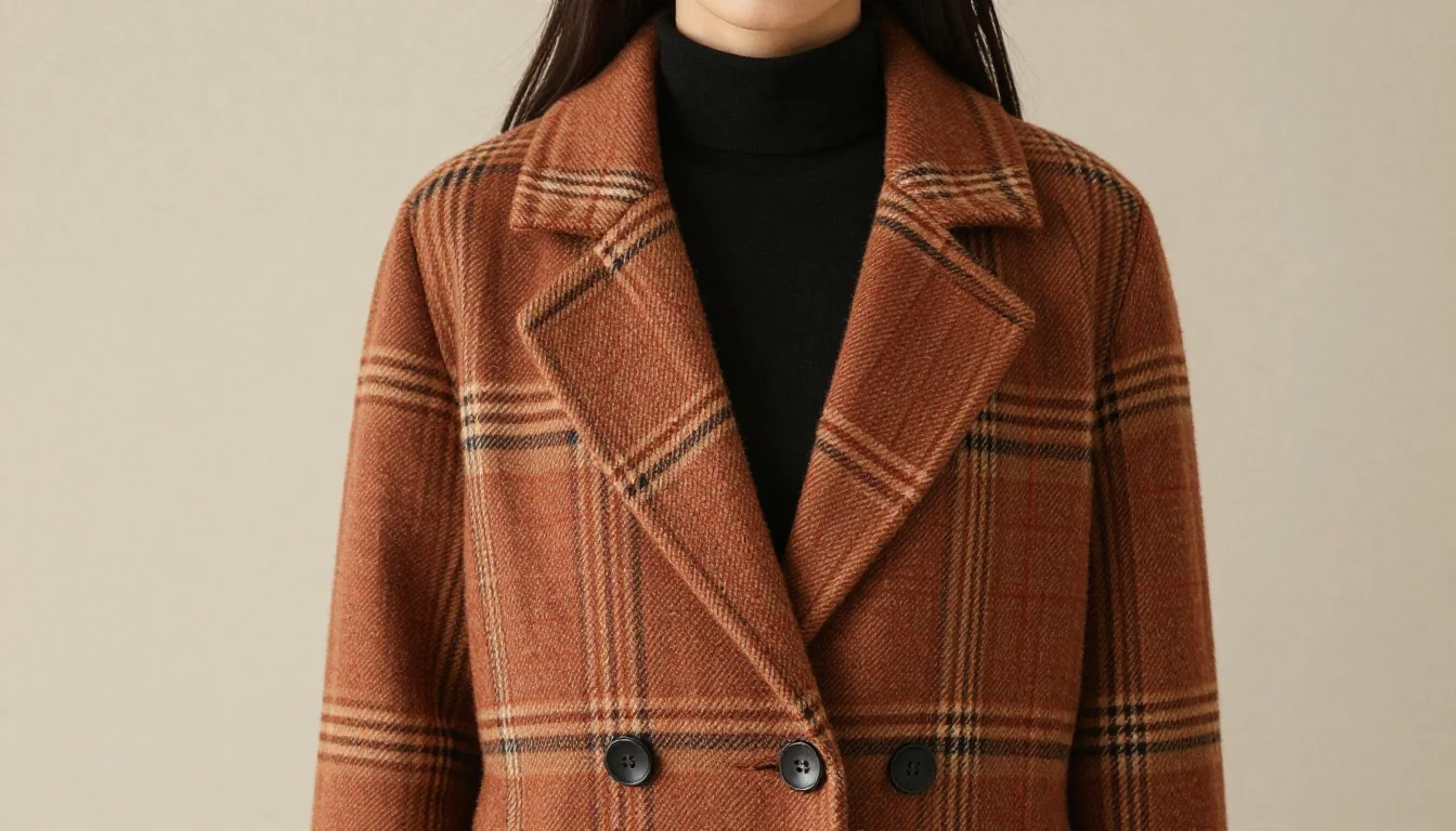
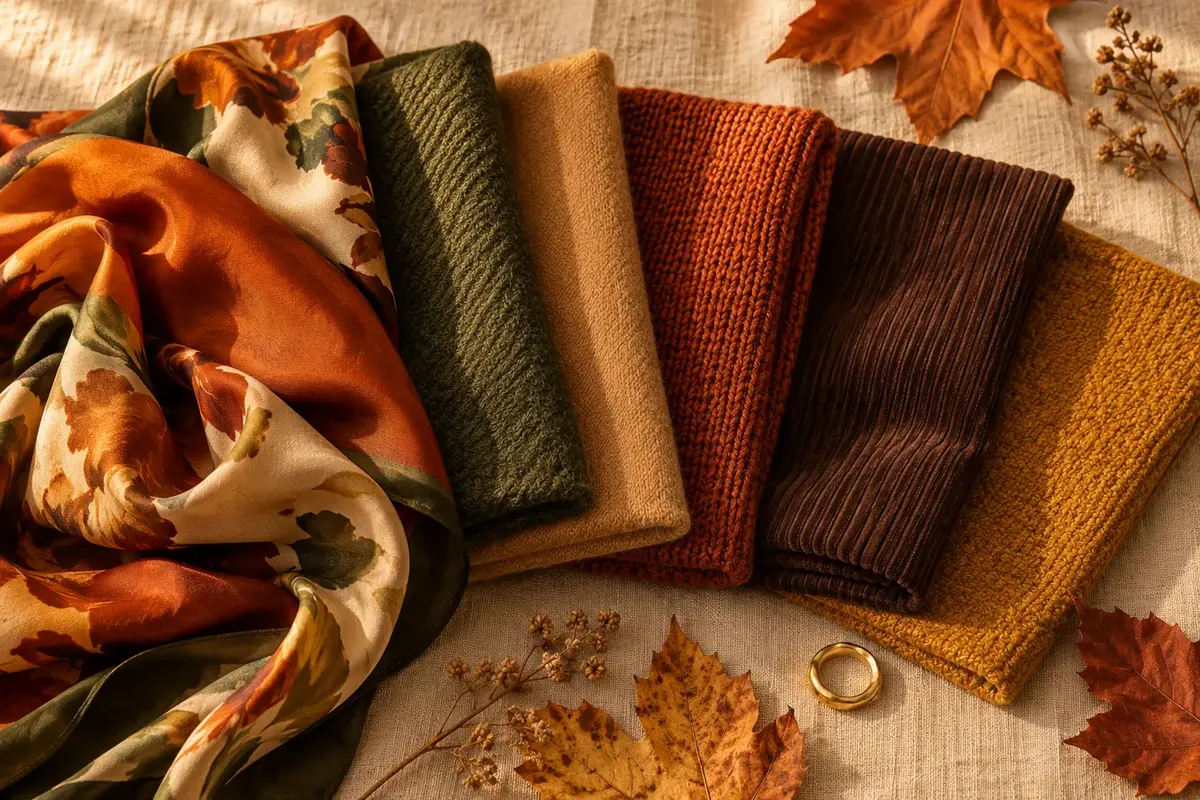
Plaid is one of the most colourway-dependent patterns in fashion — the exact same tartan grid reads entirely differently depending on whether its base tones are warm or cool. For warm undertones, the winning plaid palette draws from earth and autumn: rust, mustard, camel, burnt orange, burgundy, olive, and warm brown. These colours share the yellow-golden warmth that defines your undertone, so the pattern echoes your complexion rather than fighting it. A rust-and-camel flannel shirt or a mustard-and-olive tartan scarf creates an immediate resonance that makes the pattern look intentional and flattering rather than random.
Plaid is a grid of intersecting colours, and those colours have temperature — just like skin undertones. Warm-toned plaid uses yellowed, golden, and earthy pigments: rust, ochre, camel, burnt sienna, burgundy, and olive. Cool-toned plaid uses blue-based pigments: navy, slate, grey, icy green, and blue-red. When you wear a plaid whose temperature matches yours, the pattern and your complexion reinforce each other. When the temperatures conflict, the pattern sits awkwardly in front of your face rather than harmonising with it.
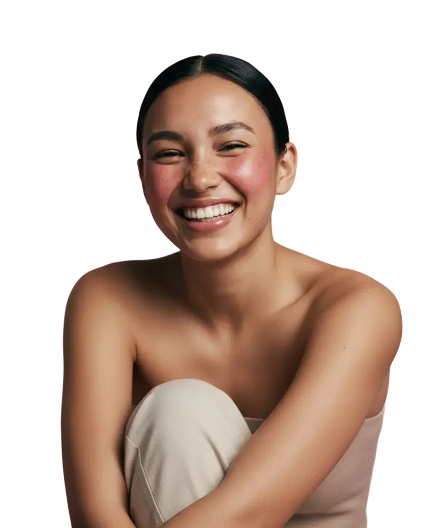
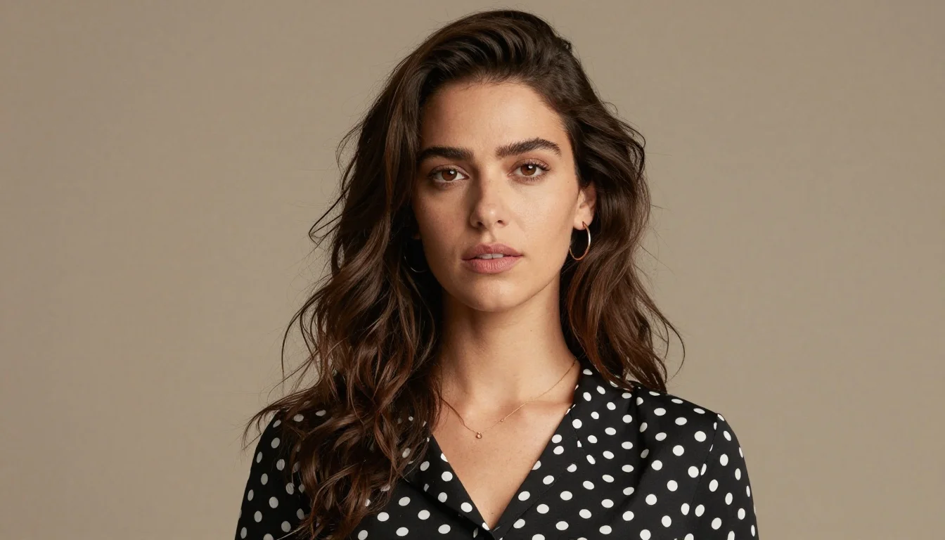
Warm undertones carry a golden, peachy, or yellow-tinged quality in the skin. This warmth responds positively to colours in the same temperature family. Rust brings out the golden warmth in fair warm skin; mustard resonates with the yellow quality in medium warm and olive skin; burgundy and rich brown add depth that grounds deeper warm complexions. The common thread is that every colour in a flattering warm plaid sits on the warm, yellow-red side of the colour wheel.
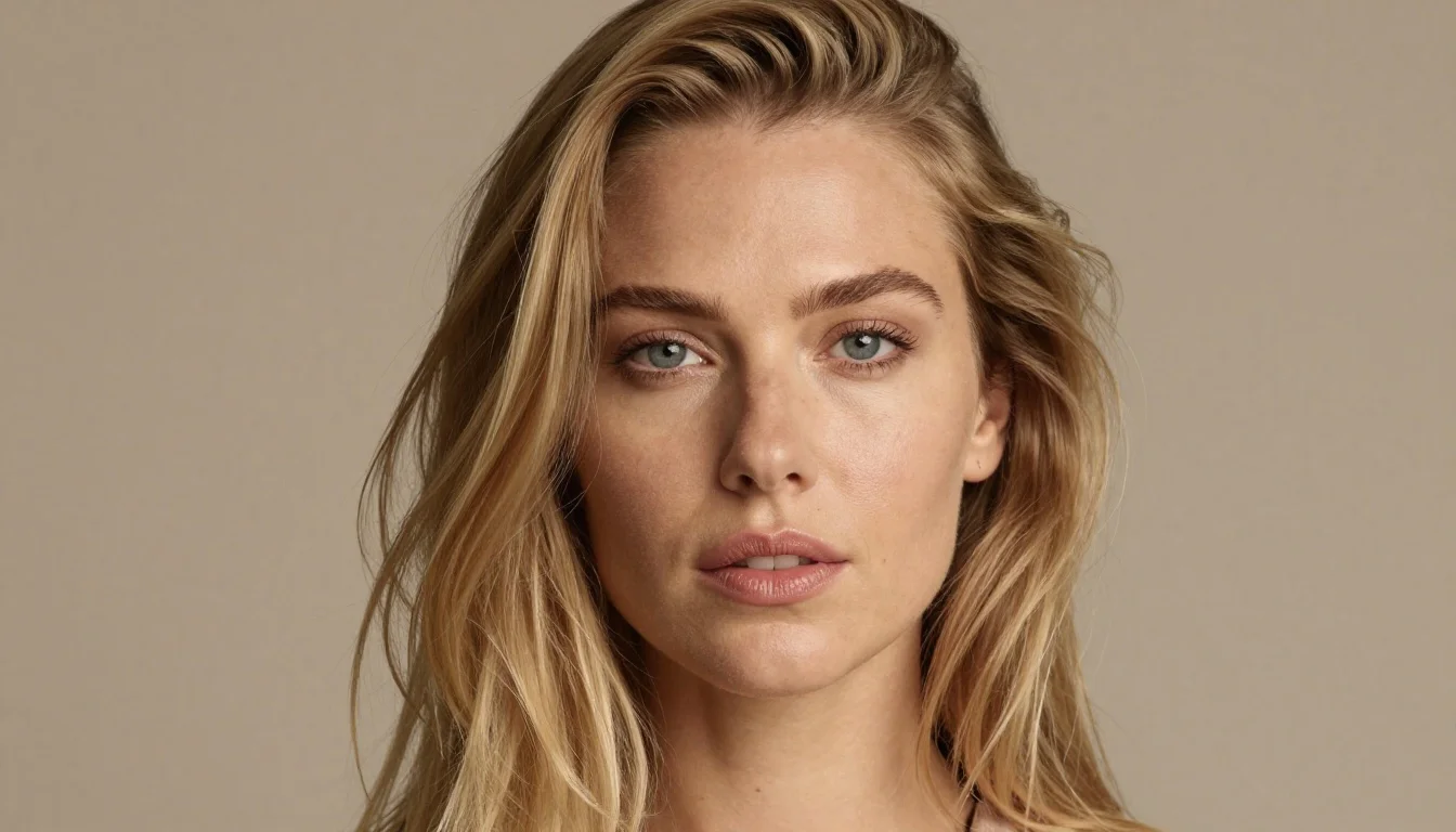
Plaids built on cool tones — navy and grey Scottish tartan, slate and blue-green flannel — introduce a cool temperature that creates visual tension with warm skin. The coolness of the pattern can pull yellow tones in warm skin to the surface in an unflattering way, making the skin look sallow or the plaid look out of place. Choosing warm-toned plaids eliminates this tension entirely.