Colors That Make OutfitsLook More Expensive
The right colors make an affordable outfit look expensive. Discover how to build looks with shades that actually flatter you.
An outfit reads as expensive or cheap long before anyone checks the label, and color is a huge part of the signal. Rich, considered colors and tonal combinations look luxurious, while a few shades and clashes read as cheap no matter the price. This guide covers the colors that make any outfit look more expensive — and the ones that quietly undercut it.


3,000+
happy clients
Why Color Signals Expense
An outfit reads as expensive or cheap long before anyone checks the label, and color is a huge part of the signal. Rich, considered colors and tonal combinations look luxurious, while a few shades and clashes read as cheap no matter the price. This guide covers the colors that make any outfit look more expensive — and the ones that quietly undercut it.
Perceived quality comes from restraint and cohesion. Expensive-looking wardrobes tend to use rich, muted, and considered colors in a limited palette, which reads as intentional and refined. Cheap-looking outfits often combine too many bright, clashing, or harsh colors, which reads as busy and unconsidered — regardless of what the pieces actually cost.
Certain colors carry inherent richness. Deep, saturated tones like burgundy, forest green, and navy look luxurious because they suggest depth and quality. Warm neutrals like camel, ivory, and taupe read as elegant and timeless. Monochrome and tonal outfits — several shades of one color — look sophisticated because they feel deliberate and cohesive.
Just as important is fit to your own coloring. A rich color that flatters your undertone looks intentional and elevated; the same color in the wrong temperature can look off and cheapen the look. Choosing expensive-reading colors that also suit you is what makes an outfit look genuinely luxe.
What colors make an outfit look expensive?
Rich warm neutrals like camel, ivory, and taupe, deep saturated tones like burgundy, forest green, and navy, and tonal monochrome palettes all read as expensive. Slightly muted jewel tones like deep teal also look luxurious and refined.
Colors That Read as Expensive
Rich Warm Neutrals
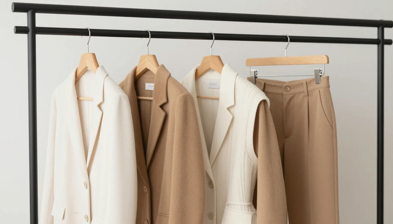
Warm neutrals are the backbone of an expensive-looking wardrobe. Camel, ivory, and taupe read as timeless and refined, especially in good fabrics. A camel coat over ivory instantly looks elevated. These quiet, sophisticated tones signal quality far more than bright or busy colors.
Deep Saturated Tones
Deep, rich colors look luxurious because they suggest depth and considered quality. Burgundy, forest green, and navy feel expensive and grounded, making excellent alternatives to black. Aubergine adds an unexpected richness. These saturated tones elevate an outfit and read as intentional.
Sophisticated Monochrome
Tonal and monochrome palettes look expensive because they feel deliberate and cohesive. Dressing in several shades of grey, or stone with off-white, reads as polished and considered. A single-color or closely-toned outfit signals restraint, which is the hallmark of an expensive look.
Muted Jewel Tones
Slightly muted jewel tones combine richness with refinement, looking expensive without shouting. Deep teal and muted emerald feel luxurious and grown-up, while rich plum adds elegance. These colors have the depth of jewel tones with a softened, sophisticated finish that reads as high quality.

Ready to see your expensive-looking colors on you?
Start my color analysisHow to Use Color to Look Expensive
Limit your palette
Build outfits from a limited, cohesive palette — one or two colors plus rich neutrals. Restraint reads as expensive, while too many colors at once reads as busy and cheap. A camel coat, ivory knit, and navy trouser looks far more luxe than a rainbow of brights.
Go tonal for instant polish
Dress in several shades of one color — stone and off-white, or shades of grey. Tonal and monochrome outfits look deliberate and sophisticated, and they are one of the easiest ways to make an affordable outfit read as expensive.
Choose depth over brightness
Reach for deep, saturated, or slightly muted colors rather than harsh neons. Burgundy, forest green, deep teal, and navy all look richer and more considered than a bright, loud shade, elevating the whole outfit.
Match rich colors to your undertone
Pick expensive-reading colors that also flatter your undertone. A rich color that suits you looks intentional and elevated; the wrong temperature can cheapen the look. Warm skin leans into camel and warm burgundy; cool skin into charcoal and dusty sapphire.

Create a polished palette from one garment
Expensive-looking outfits repeat color with restraint. Try an easy or tonal combination in the outfit color combination matcher and use the result as your shopping filter.
Colors That Can Look Cheap
Harsh neon brights
Very bright, saturated neons often read as cheap because they look loud and unconsidered. If you want color, a muted or deep version of the same shade looks far more expensive than a highlighter-bright one.
Too many clashing colors
Combining several competing bright colors with no cohesion reads as busy and cheap. A limited, tonal palette with one or two colors and rich neutrals looks far more expensive and intentional.
Muddy, off greens and browns
Murky, greyed-off greens and browns can look cheap and drab, especially in synthetic-looking fabrics. A clean, rich version of the same color reads as considered and elevated.
Stark, flat black in poor fabric
Flat, dense black can look cheap when the fabric is low quality, showing every flaw. Deep navy, charcoal, or a rich brown often reads more expensive and is more forgiving than a harsh, flat black.
Warm or cool? It shapes your luxe palette
Find my undertoneSwaps to Make an Outfit Look More Expensive
Small color changes that instantly elevate a look.
A rich, softened color reads considered where neon reads cheap.
A deep neutral looks richer and hides fabric flaws better.
Cohesion and restraint read as expensive.
A rich, clean color looks elevated where a murky one looks cheap.
A soft warm white reads more luxurious than a harsh bright white.
Which Palette Might Be Yours?
The expensive-reading colors that also flatter you depend on your season. Confirming it means every luxe color you choose suits your complexion too.
Deep Autumn
Learn moreIf rich warm neutrals and deep tones flatter you, deep autumn may be your palette — camel and burgundy look expensive on you.
Cool Summer
Learn moreIf soft, cool, tonal palettes suit you, cool summer could be yours — charcoal and dusty sapphire read luxe.
Deep Winter
Learn moreIf deep, cool, sophisticated colors flatter you, deep winter may fit — navy, aubergine, and rich plum look expensive.
Find Your Exact Colors
The colors that make an outfit look expensive are richest when they also flatter your coloring. A personalized color analysis names your season, so you know exactly which camel, burgundy, or charcoal will look both luxurious and flattering — turning an affordable wardrobe into an expensive-looking one.

Related Guides for Colors That Make Outfits Look More Expensive
Explore more personalized color advice based on your features.
Want to see these colors on you? What Colors Look Good on Me — free to try.
Frequently Asked Questions About Colors That Make Outfits Look More Expensive
What colors make an outfit look expensive?
Rich warm neutrals like camel, ivory, and taupe, deep saturated tones like burgundy, forest green, and navy, and tonal monochrome palettes all read as expensive. Slightly muted jewel tones like deep teal also look luxurious and refined.
What colors make an outfit look cheap?
Harsh neon brights, too many clashing colors, muddy off greens and browns, and flat black in poor fabric tend to look cheap. They read as loud, busy, or drab rather than considered. Muted, deep, cohesive colors look far more expensive.
Does black look expensive?
It can, but only in good fabric — flat, dense black in cheap material shows flaws and can look cheap. Deep navy, charcoal, or rich brown often reads more expensive and is more forgiving than a harsh, flat black.
Why do tonal outfits look expensive?
Tonal and monochrome outfits look expensive because they feel deliberate and cohesive. Dressing in several shades of one color signals restraint and intention, which are hallmarks of an expensive, considered look.
How do I make a cheap outfit look expensive with color?
Limit your palette to one or two colors plus rich neutrals, choose depth over brightness, and go tonal where you can. Swapping neon for a muted jewel tone, or flat black for navy, instantly elevates an affordable outfit.
Do expensive-looking colors depend on my skin tone?
Yes — a rich color that flatters your undertone looks intentional and elevated, while the wrong temperature can cheapen the look. Warm skin suits camel and warm burgundy; cool skin suits charcoal and dusty sapphire. Choosing luxe colors that also suit you is key.