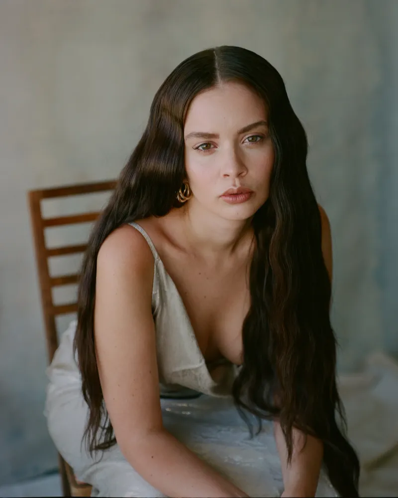
Lily-Rose DeppColor Analysis & Palette
Discover Lily-Rose Depp's signature Soft Summer palette — then preview the same colors on your real face.
3,000+
happy clients


Soft Summer Analysis
Lily-Rose Depp is a Soft Summer. Lily-Rose's most flattering colors are powder pink, dusty lilac, mist gray.
For Lily-Rose, a Soft Summer read means powder pink, dusty lilac, mist gray flatter the undertone instead of fighting it.
Lily-Rose leans into Parisian pastels, airy lace, and modern coquette accents that complement a muted, powdery palette. Lily-Rose is most radiant in powder pink, dusty lilac, mist gray, soft navy, and rose beige balanced by blue-gray, dusty plum, and soft navy neutrals, leaning into the soft summer story of hazy pastels, muted berries, and cool-moss neutrals.
Best Colors for Lily-Rose
These shades harmonize with Lily-Rose's natural contrast levels and enhance their soft summer characteristics.
Powder pink
#FFB3BA
Dusty lilac
#C8A2C8
Mist gray
#DCDCDC
Soft navy
#4A5F7F
Rose beige
#E8D4C0
Undertone
Neutral-cool with delicate contrast, favoring hazy pastels and vintage-inspired tones. Lean into blue-gray, dusty plum, and soft navy neutrals and avoid sharp black or fiery orange that overwhelms the softness.
Pro Tips
- Use powder pink near the face for maximum impact
- Use dusty lilac near the face for maximum impact
- Use mist gray near the face for maximum impact
- Use soft navy near the face for maximum impact
How Lily-Rose Wears It
Soft Summer Styling
Incorporate bow details, mini cardigans, and vintage slips. Keep fabrics lightweight—silk, lace, and chiffon thrive. Lily-Rose can pair brushed cotton, heathered knits, and matte silk with brushed silver, pewter, and vintage pearls to match the soft summer palette while highlighting powder pink, dusty lilac, mist gray, soft navy, and rose beige.
Join 3,000+ women whofound their perfect colors
"I was hesitant about AI color analysis at first, but the results were surprisingly accurate. My friends keep commenting on how much better I look lately."
 Diana
Diana"I discovered I'm a True Summer and the cool undertone recommendation has made such a difference in how I look in photos. My makeup routine is completely different now."
 Maria
Maria"The AI Studio feature completely changed how I shop. I can see myself in different colors before buying anything, which has saved me from so many wardrobe mistakes."
 Hilda
HildaReady to preview your own palette?
Get your personalized color analysis the moment you sign up, plus 15 credits to preview a photoshoot, hair color, or makeup — on your real face.
More Celebrity
Color Palettes
Explore how other celebrities embrace their unique seasonal palettes


Lily-Rose Depp Color Questions
What color season is Lily-Rose Depp?
Lily-Rose Depp is a Soft Summer. This means Lily-Rose's natural coloring—skin undertone, eye color, and hair—harmonizes best with the soft summer palette. Neutral-cool with delicate contrast, favoring hazy pastels and vintage-inspired tones. Lean into blue-gray, dusty plum, and soft navy neutrals and avoid sharp black or fiery orange that overwhelms the softness. Palette Hunt's AI follows the 16-season Sci\ART system, which expands Carole Jackson's original four-season system into 16 sub-seasons to classify coloring by undertone, value, and chroma.
What are Lily-Rose's best colors to wear?
Lily-Rose's most flattering colors include powder pink, dusty lilac, mist gray. As a Soft Summer, Lily-Rose looks best in shades that complement their natural contrast and undertone. Incorporate bow details, mini cardigans, and vintage slips. Keep fabrics lightweight—silk, lace, and chiffon thrive. Lily-Rose can pair brushed cotton, heathered knits, and matte silk with brushed silver, pewter, and vintage pearls to echo the soft summer palette while highlighting powder pink, dusty lilac, mist gray, soft navy, and rose beige. The principle behind color analysis is simple: shades that share your undertone, value, and chroma reflect light evenly onto the face, while clashing tones cast shadows—so wearing your season tends to look more harmonious and flattering.
Am I the same color season as Lily-Rose Depp?
If you share similar features with Lily-Rose Depp—particularly skin undertone, eye color, and natural hair color—you may be a Soft Summer too. Neutral-cool with delicate contrast, favoring hazy pastels and vintage-inspired tones. Lean into blue-gray, dusty plum, and soft navy neutrals and avoid sharp black or fiery orange that overwhelms the softness. However, for a precise determination, Palette Hunt's AI color analysis tool provides personalized results by analyzing your actual photo rather than relying on a celebrity comparison alone.
How does Lily-Rose's soft summer palette influence their style?
Lily-Rose's soft summer palette is central to their signature look. Chanel haute couture tweeds, The Idol press tour coquette minis, and paparazzi looks in cloudlike pastels. Each appearance plays with hazy pastels, muted berries, and cool-moss neutrals and accents of powder pink, dusty lilac, mist gray, soft navy, and rose beige. Stylists lean on color analysis to make sure red carpet and editorial looks work with a client's natural coloring rather than against it, which is why understanding your own palette has become a popular foundation for personal style.
What undertone does Lily-Rose Depp have?
Lily-Rose Depp has Neutral-cool with delicate contrast, favoring hazy pastels and vintage-inspired tones. Lean into blue-gray, dusty plum, and soft navy neutrals and avoid sharp black or fiery orange that overwhelms the softness. This undertone is a key factor in the Soft Summer classification, influencing which shades of clothing, makeup, and hair color look most harmonious against their skin.