Warm Winter Color Palette: Is It a Real Season?

The quick answer
Warm Winter is not a named season in Palette Hunt's 16-season system. Winter is defined by coolness, while dominant warmth moves you toward Spring or Autumn. The look people mean is real, though: deep Winter contrast with slightly warmer jewel tones and metals. Your closest official season is usually Bright Winter, Deep Winter, or Warm Autumn.

Color analysis you can trust
Use the most advanced AI color analysis and then see your colors come to life with our AI photoshoot.
Table of Contents
Search for warm winter color palette and you will find moodboards full of burgundy, teal, espresso and gold—but little agreement on what the label means. The confusion comes from mixing a visual preference with a seasonal diagnosis. You can love a warmer-looking Winter palette without having a warm undertone. The question is which temperature, depth and clarity your face actually supports.
The Warm Winter Color Palette: 18 Useful Shades
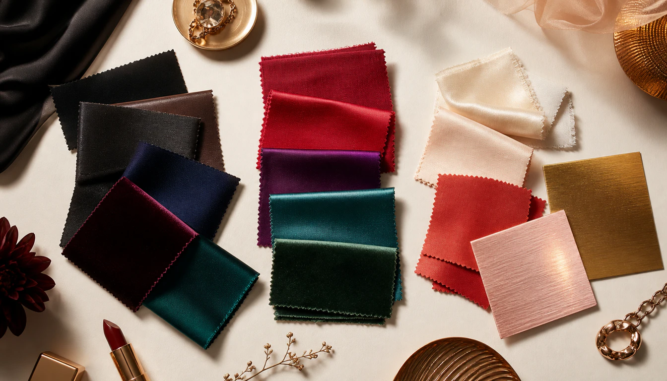
This is the palette most people are picturing: dark, crisp Winter foundations with warmth introduced carefully. Cranberry replaces blue-red, espresso softens pure black, and antique gold appears as an accent rather than the dominant metal. It is a useful wardrobe palette—not a new diagnosis.
THE “WARM WINTER” COLOR PALETTE
Winter depth and contrast, softened with neutral-warm accents
DEEP NEUTRALS
WARM-LEANING JEWEL TONES
LIGHTS & ACCENTS
Why Warm Winter Is Not One of the 16 Seasons
Seasonal color analysis names a season by its dominant qualities. Winter combines cool temperature, strong contrast and either depth or clarity. If warmth becomes the leading quality, the result belongs to Spring or Autumn—even if the person also has dark hair or enjoys dramatic colors. That is why the 16-season system includes Bright, Deep, True/Cool and Clear Winter variants, but no official Warm Winter result.
A neutral undertone creates the gray area. Neutral-cool Winters may borrow a controlled amount of warmth without losing their Winter structure. That borrowing range is what the informal label is trying to describe.
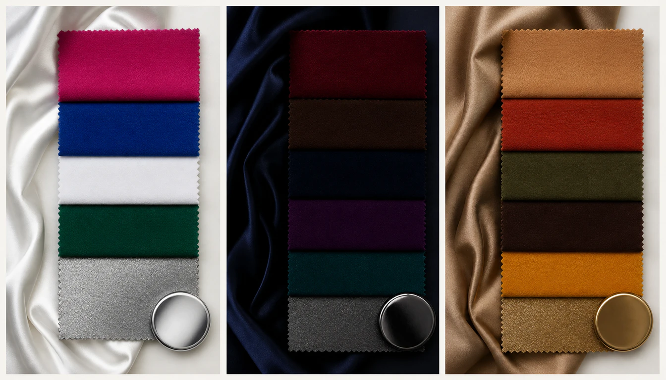
If You Relate to Warm Winter, Start With These Three Seasons
Bright Winter
Choose this lane when clarity and contrast dominate. Electric teal, vivid cranberry and bright white look alive, while dusty earth tones look flat.
See the Bright Winter guide →Deep Winter
Choose this lane when depth dominates. Espresso, black cherry, deep teal and ink navy work beautifully, but orange, camel and mustard still turn muddy.
See the Deep Winter guide →Warm or Deep Autumn
Choose this lane when warmth wins. Chocolate, rust, olive, camel and gold make your skin glow, while pure black and icy jewel tones feel severe.
See the Warm or Deep Autumn guide →Three At-Home Tests: Winter or Autumn?
- Black vs chocolate. Black should sharpen a Winter's features; chocolate should harmonize more naturally with an Autumn.
- Fuchsia vs rust. Clear cool fuchsia points to Winter. Earthy rust or paprika points to Autumn. If both fail, test a softer neutral season.
- Silver vs yellow gold. Silver or mixed metals favor neutral-cool Winter. Strong yellow gold clearly winning is evidence that warmth is dominant.
Use bare skin, indirect daylight and no camera filter. If every comparison is close, the free color analysis quiz will narrow the family before a photo analysis confirms the exact season.
How to Wear the Warm Winter Look Without Fighting Your Undertone
- Keep Winter contrast. Pair ivory with espresso, cranberry with ink navy, or peacock teal with warm black.
- Add warmth in small areas. Use rose gold jewelry, an antique-gold bag clasp or an icy-peach scarf instead of building the whole outfit around camel and orange.
- Choose blue-based warm colors. Cranberry, black cherry and aubergine read warmer than fuchsia while staying compatible with neutral-cool skin.
- Let your real season set the ratio. Bright Winter needs more clarity, Deep Winter more darkness, and Autumn more earthy warmth.
Warm Winter FAQ
Is Warm Winter a real color season?
Warm Winter is not a named result in Palette Hunt’s 16-season system. Winter is fundamentally cool, while warmth points toward Spring or Autumn. People who use the label usually mean a neutral Winter who tolerates a little warmth, most often Bright Winter or Deep Winter.
What colors are in a Warm Winter color palette?
The palette people usually mean combines Winter depth and contrast with warmer accents: warm black, espresso, ink navy, cranberry, warm ruby, aubergine, peacock teal, forest green, icy peach, soft ivory, antique gold and rose gold.
Is Warm Winter the same as Deep Winter?
Not exactly. Deep Winter is a recognized season with cool-neutral, dark, high-contrast coloring. It is one of the most likely real matches when someone identifies with Warm Winter, especially when espresso, black cherry and deep teal work better than icy brights.
Am I Warm Winter or Warm Autumn?
Compare black with chocolate brown, fuchsia with rust, and silver with gold. If black, clear jewel tones and silver still win, you are likely in Winter. If chocolate, rust, olive and gold look more natural, warmth is dominant and Warm or Deep Autumn is more likely.
Can a Winter wear gold jewelry?
Neutral Winters can often wear rose gold, mixed metals or restrained antique gold, especially away from the face. Bright yellow gold is a stronger test: if it consistently outperforms silver, you may belong to a warm season rather than Winter.
Find Your Real Season
Turn the Warm Winter moodboard into a palette matched to your undertone, contrast and depth