Fair skin's high luminosity creates a specific professional challenge — the wrong office colors make pale skin look tired or washed out, while the right ones create a polished, commanding presence. The standard corporate wardrobe of cool grey and dusty beige is actually one of the worst combinations for fair skin. The solution is a deliberate professional palette built around color families that amplify fair skin's natural quality.
In professional settings, how you look affects how you're perceived — and for fair skin, the wrong colors compound rather than offset its delicate quality. Cool grey suiting against pale skin creates a two-cool-tones problem: both the fabric and the skin sit in a similar cool-light register, and neither provides contrast or warmth. The result looks underpowered rather than polished.
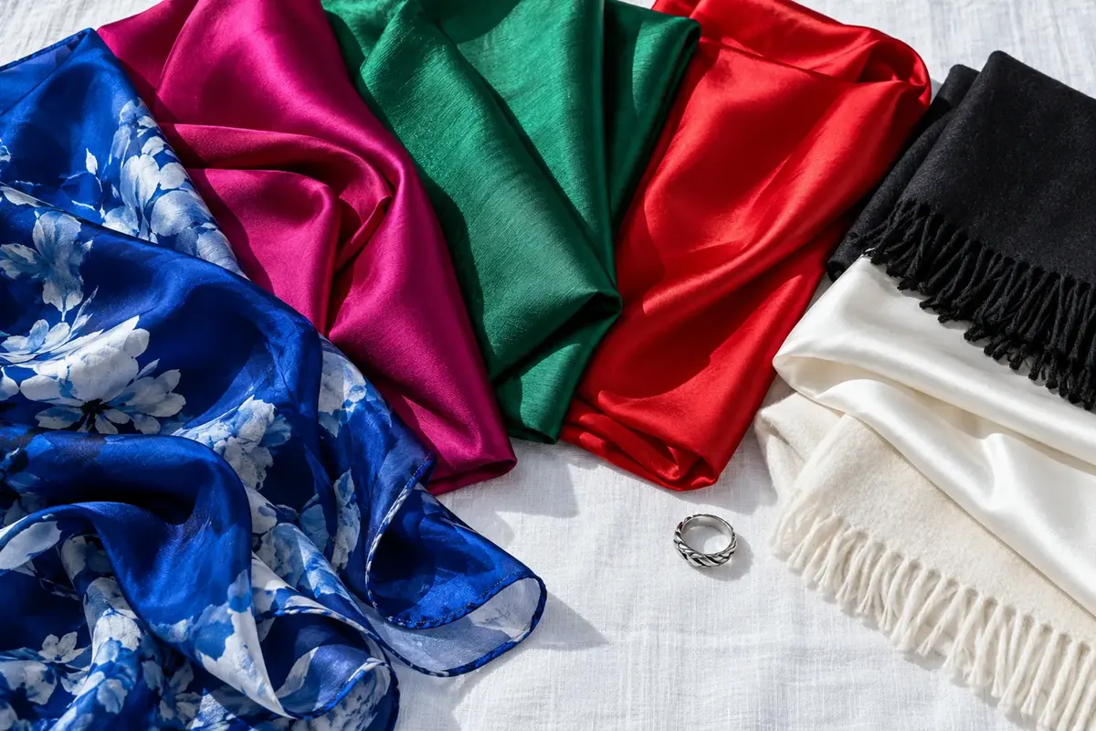
Fair skin benefits most from professional colors that do one of two things: create clean, high-contrast depth (navy, forest green, deep berry) or add warmth that makes fair skin look flushed and alive (blush, warm ivory, soft terracotta). Both approaches work in professional environments when chosen thoughtfully. The key is avoiding the muddy middle — dusty beige, cool khaki, washed-out grey — that serves no contrast or warmth function.
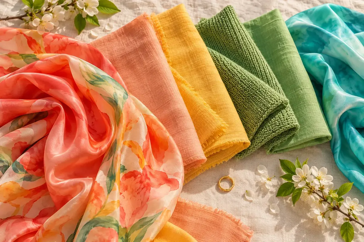
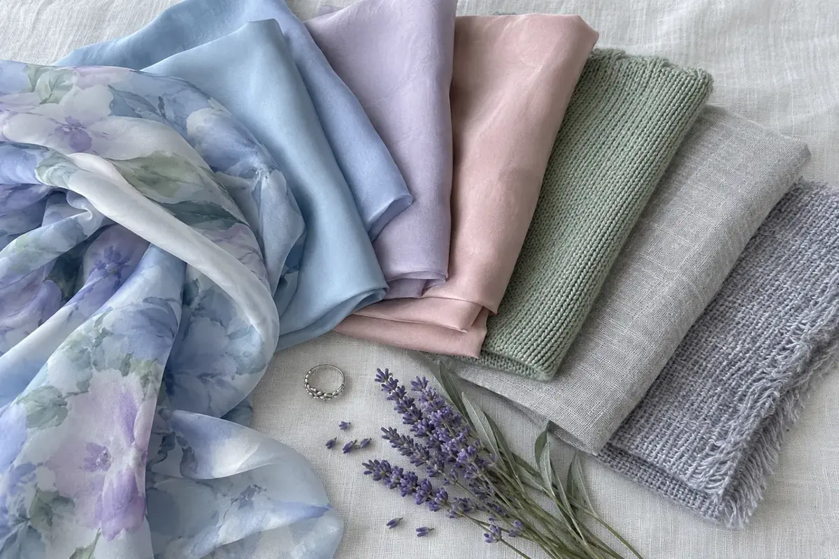
Your skin's undertone determines which direction to take. Warm fair skin (peachy, golden undertone) thrives in warm professional colors: camel blazer, cream blouse, forest green, deep rust. Cool fair skin thrives in cool-clear colors: deep navy, sharp black, soft lavender, porcelain white. Neutral fair skin can move between both depending on the rest of the outfit.